

Providers think in patients, not cards.
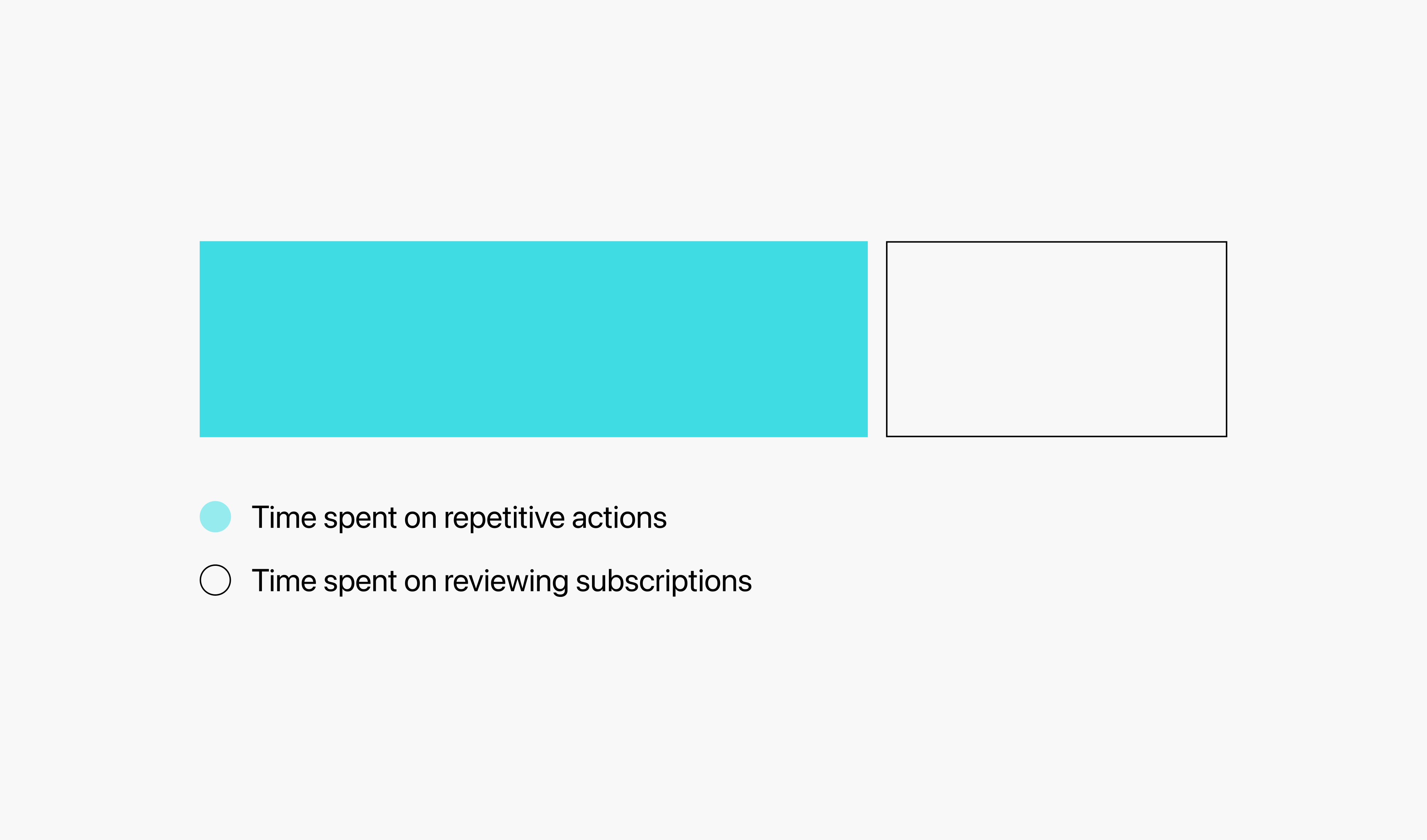
Providers often manage 3–12 subscriptions per patient, so editing them one card at a time was slow, and easy to mess up.

VIBRANT AMERICA · 2025

Overview
Vibrant America’s provider portal supports the full lab testing workflow, including test ordering, patient management, lab report setup, and recurring sample send-outs.
My team redesigned the Subscription page to make recurring lab orders easier to review, select, and send.

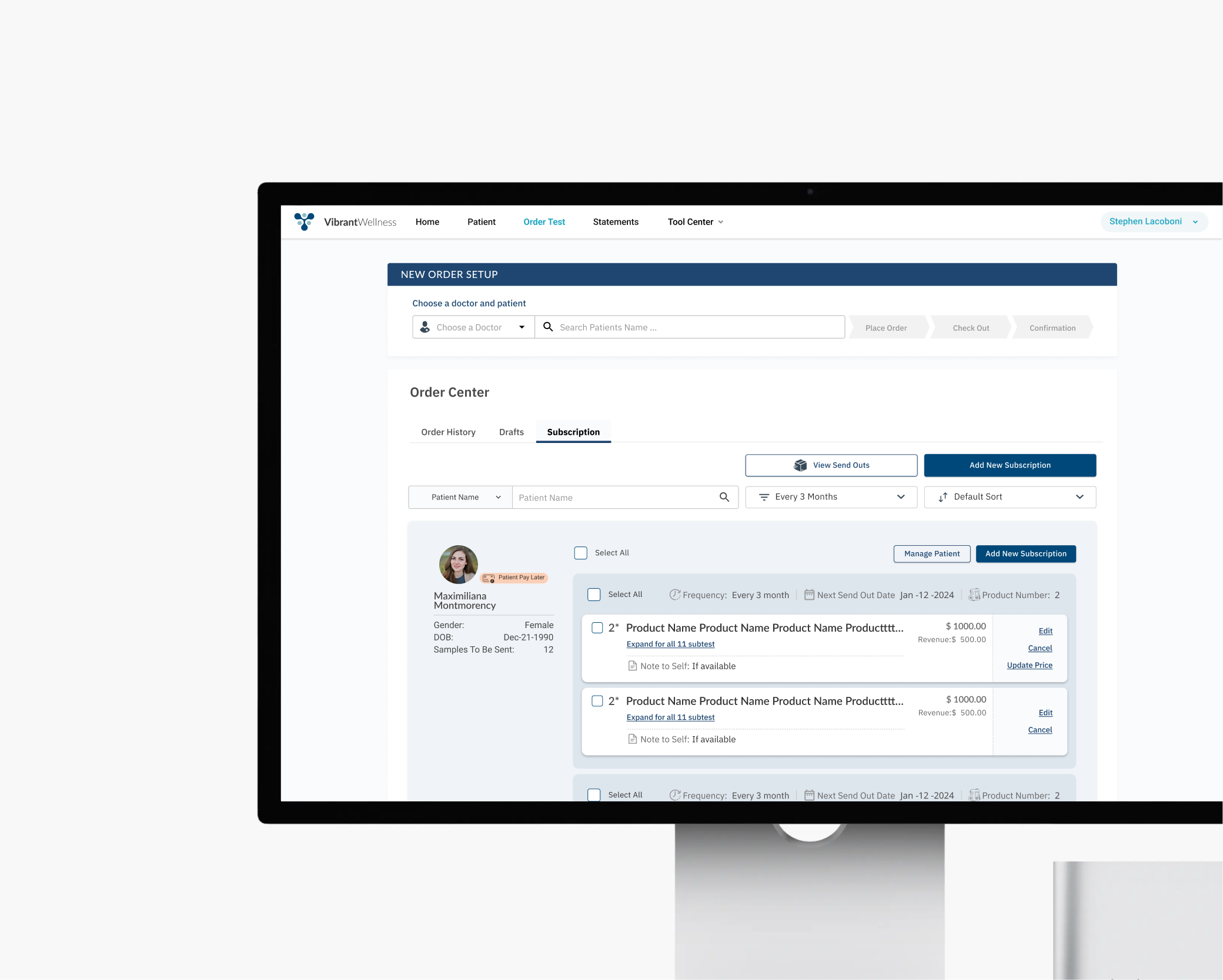
Each patient could carry multiple active subscriptions, but a card grid buried them under duplicate info with no way to act on more than one at a time.
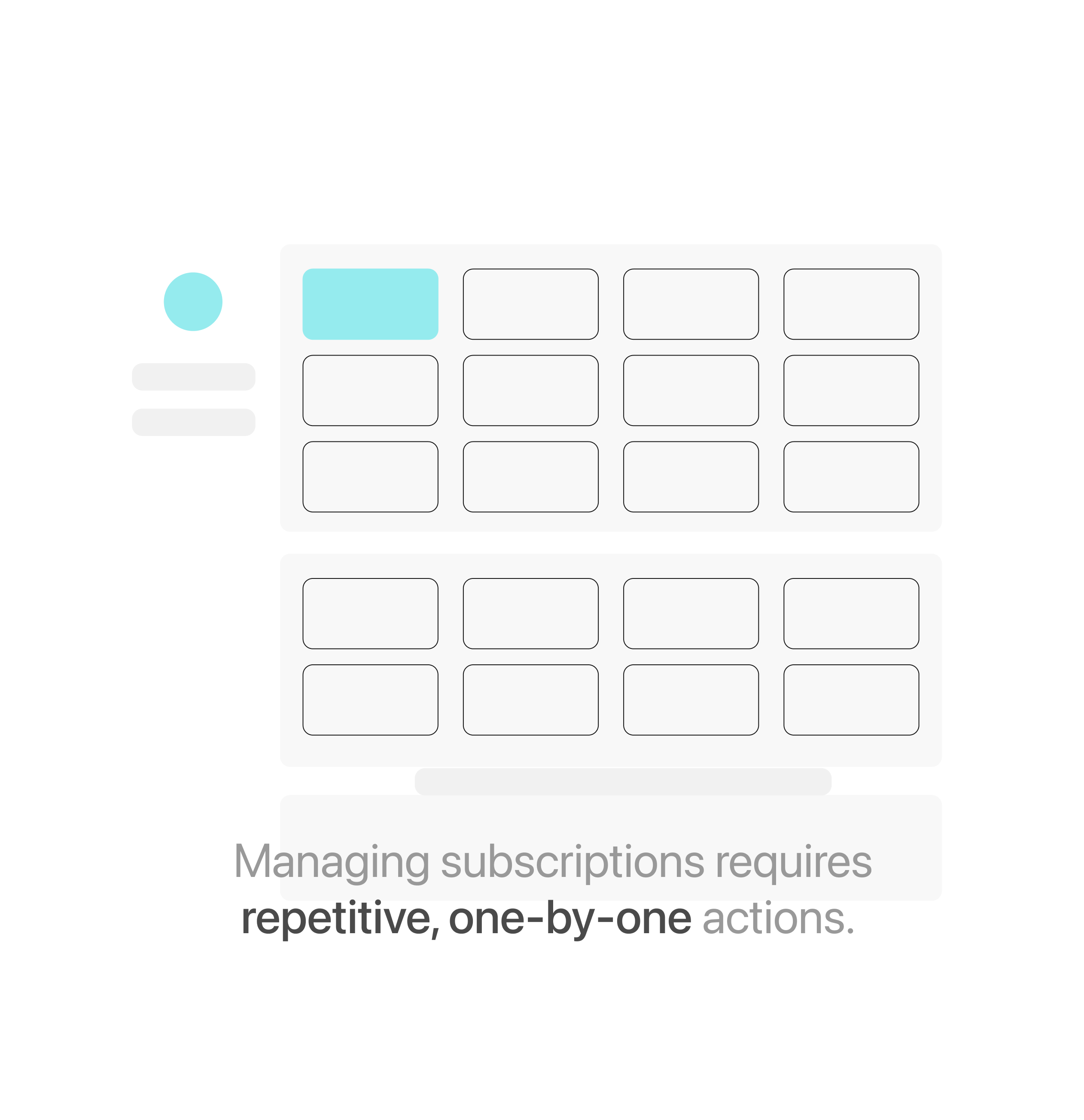
Providers often manage 3–12 subscriptions per patient, so editing them one card at a time was slow, and easy to mess up.
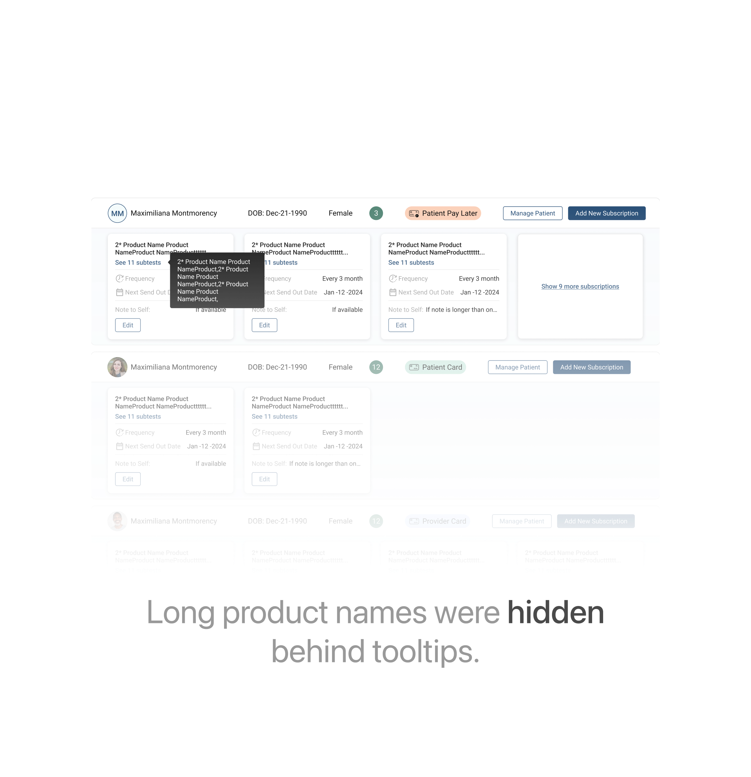
Truncated titles triggered tooltips that popped up right over the action buttons next to them.
A fixed left column holds avatar, gender, DOB, and samples to be sent — freeing the right column to just be about subscriptions.
What’s inside the info card
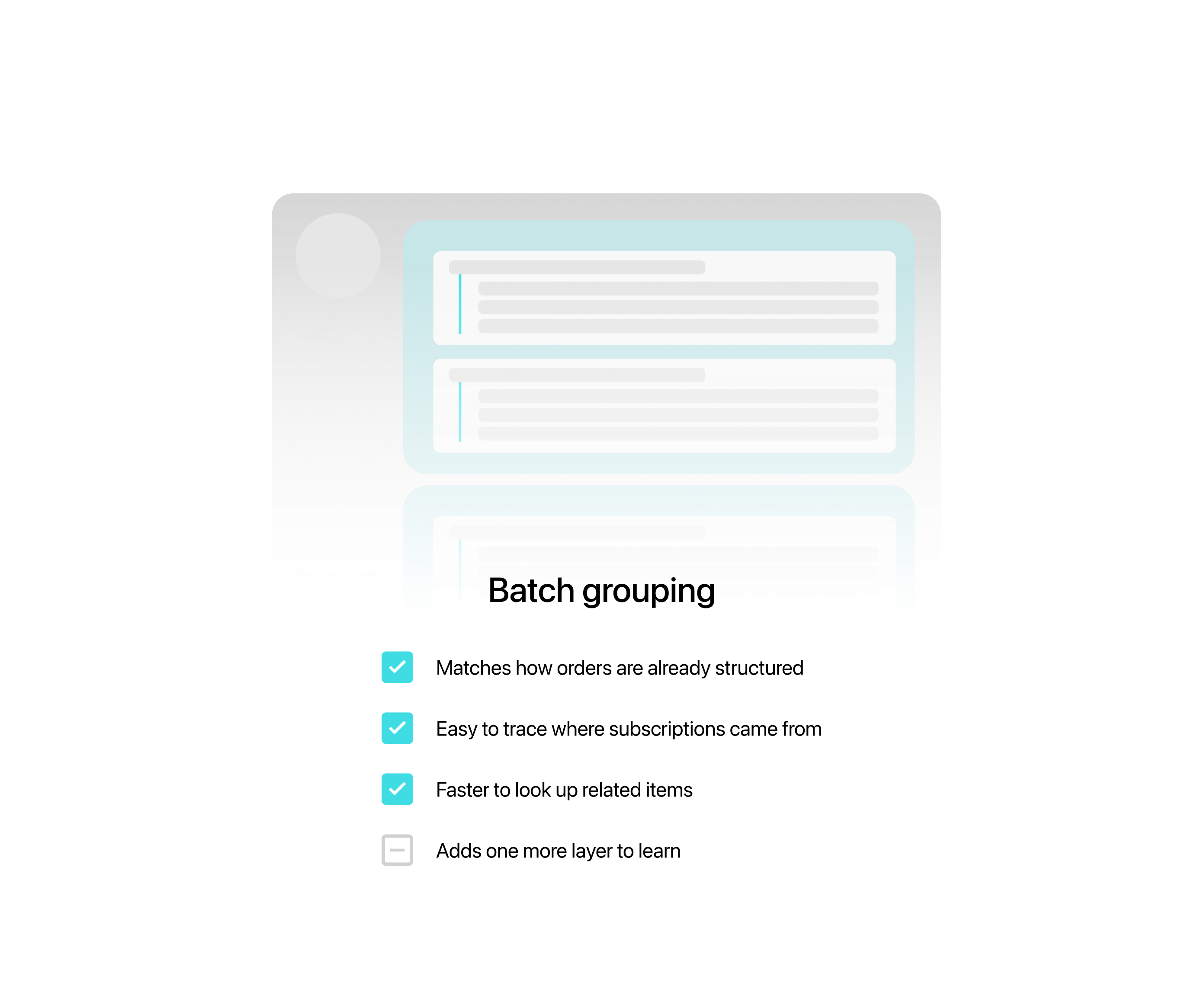
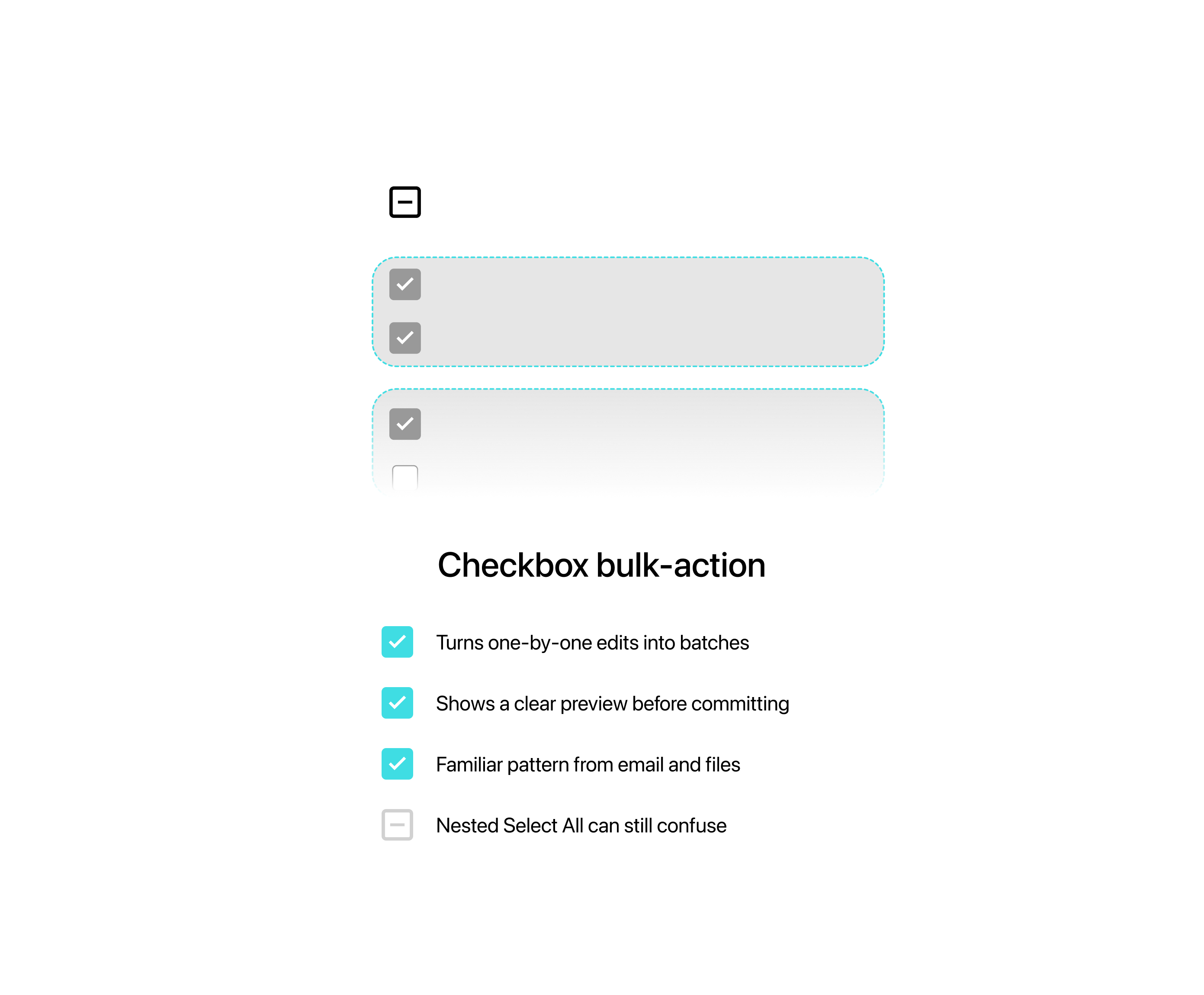
Every subscription gets its own checkbox, plus a Select All for the whole set, so providers can act on several at once.
Batch editing
Subscriptions from the same order carry a label like “Created by order (1233344), last edited on Jan-01-2025 11:00 AM,” so their origin stays traceable.
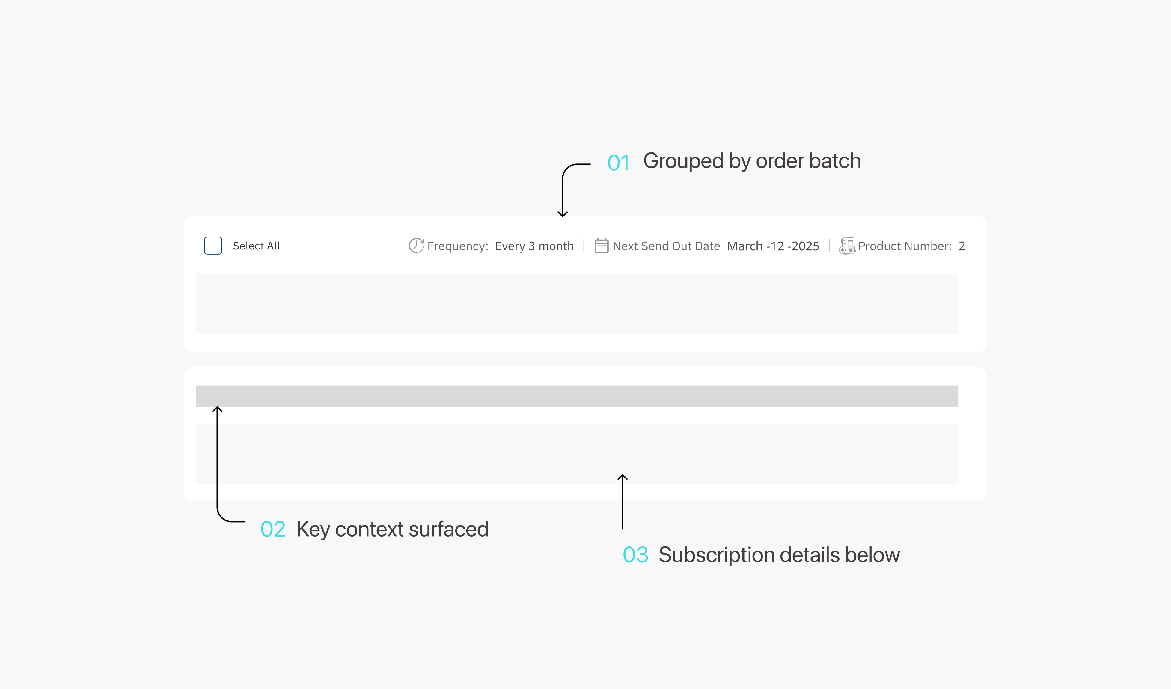
Anatomy of a subscription block
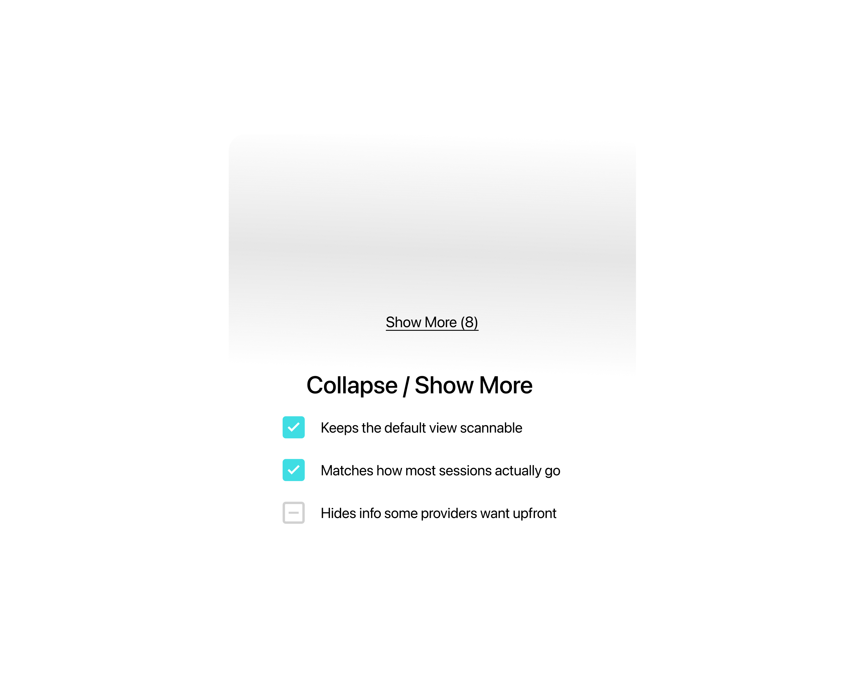
Each patient defaults to 2–3 visible subscriptions, with the rest tucked behind a “Show More (9)” — enough to stay useful without overwhelming the screen.
Collapsed vs. expanded, and why it matters
Research
As the Subscription feature grew, patient count and order volume kept climbing — but the page was still the same card grid built for a handful of subscriptions.
Every new patient added made it more crowded. So did every new subscription.
Rather than assume, I went straight to the people using this page every day.
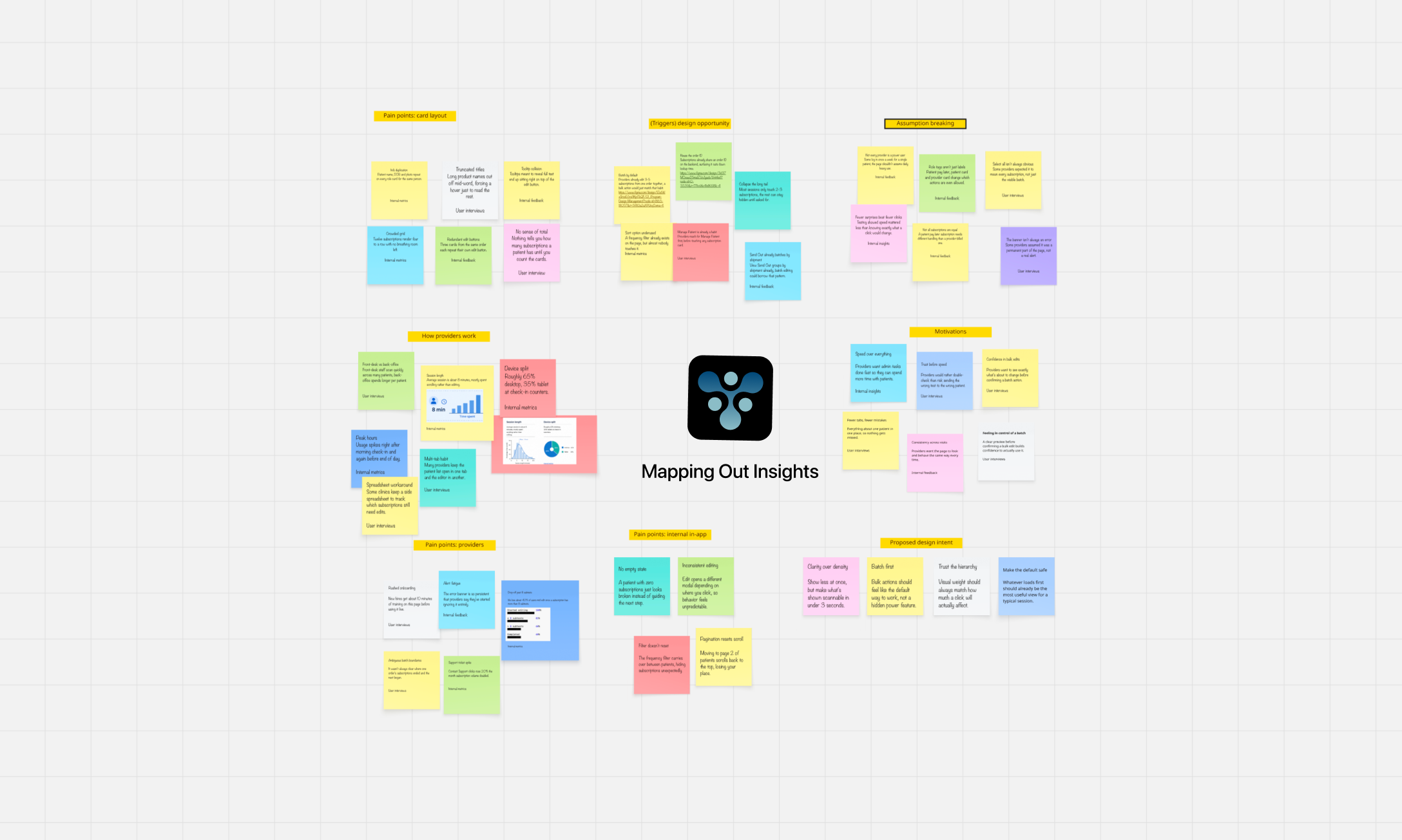
All of our sorted insights

The research pointed in a clear direction, and became our north star:
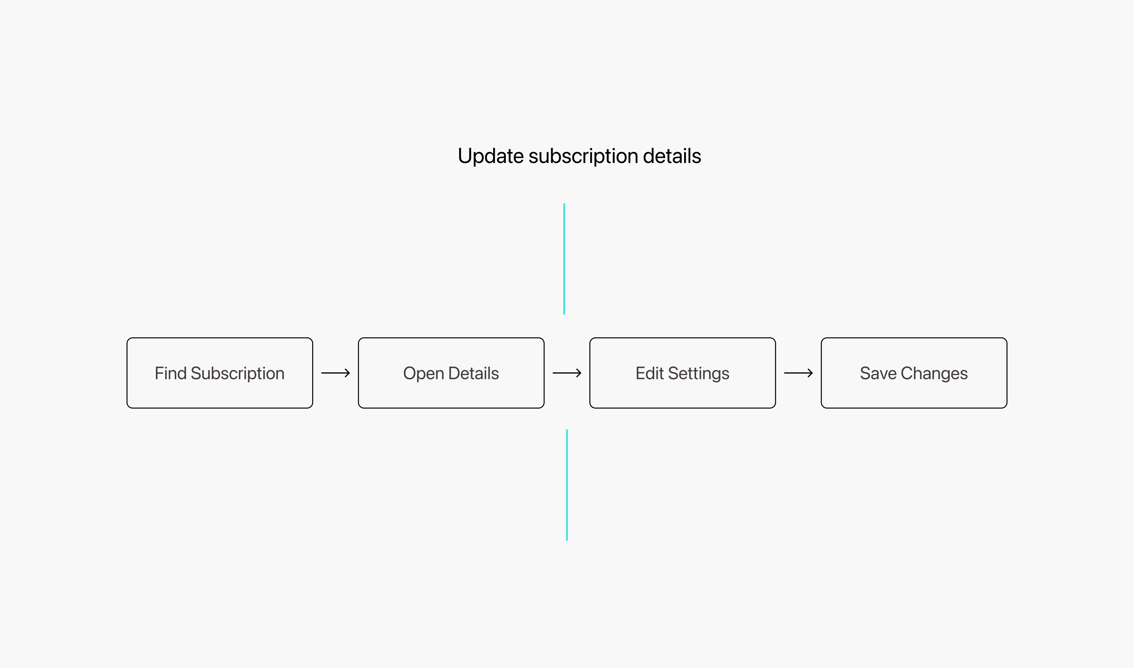
Digging into usage patterns and internal feedback, the pain kept clustering around the same three things: can’t find it, can’t finish editing, can’t read it clearly.
Working closely with engineering meant every idea got checked against the data model and the build timeline before it went any further.
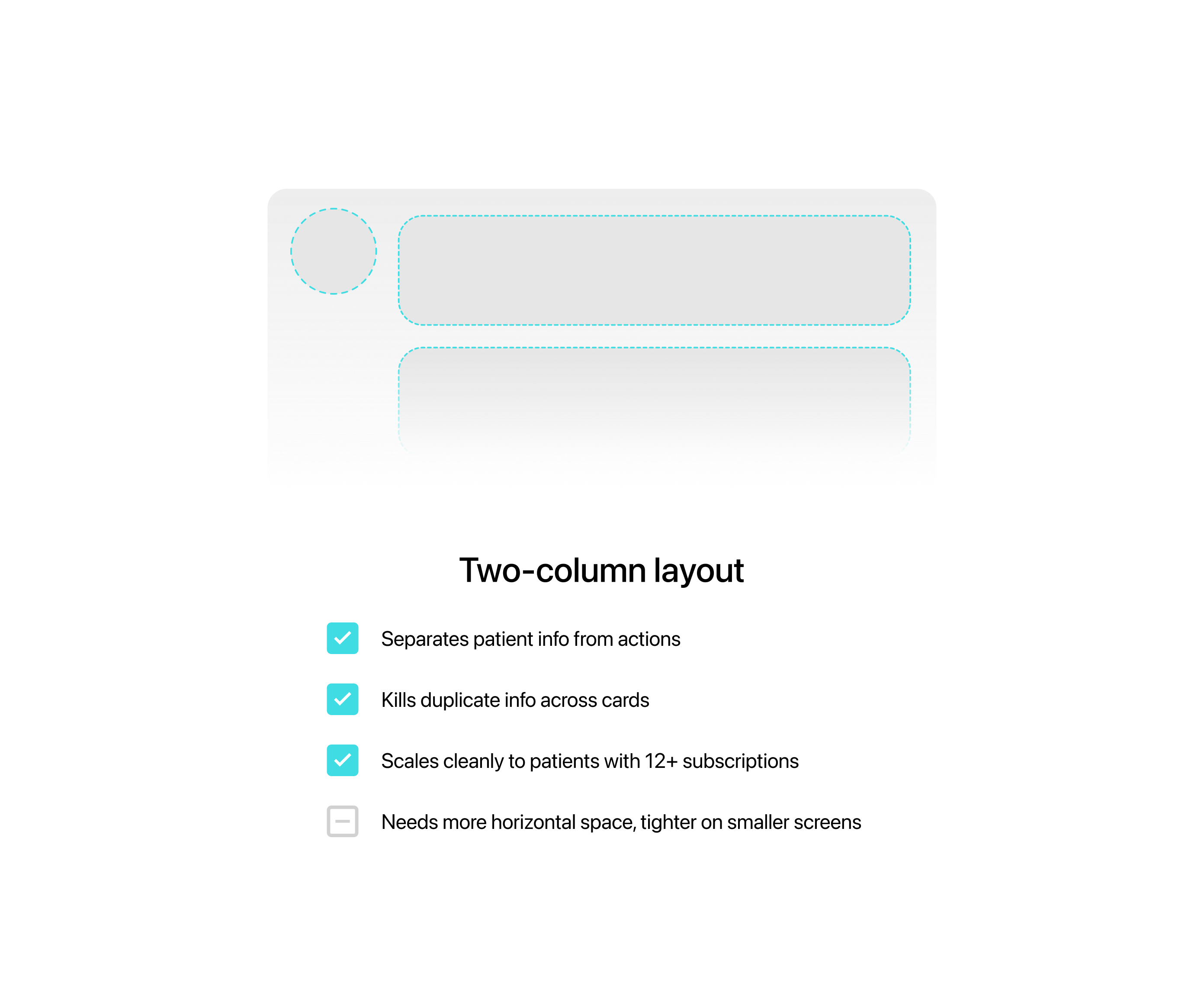
Looking at similar healthcare back-office tools, I went through plenty of list and grouping layouts before landing on the final one.
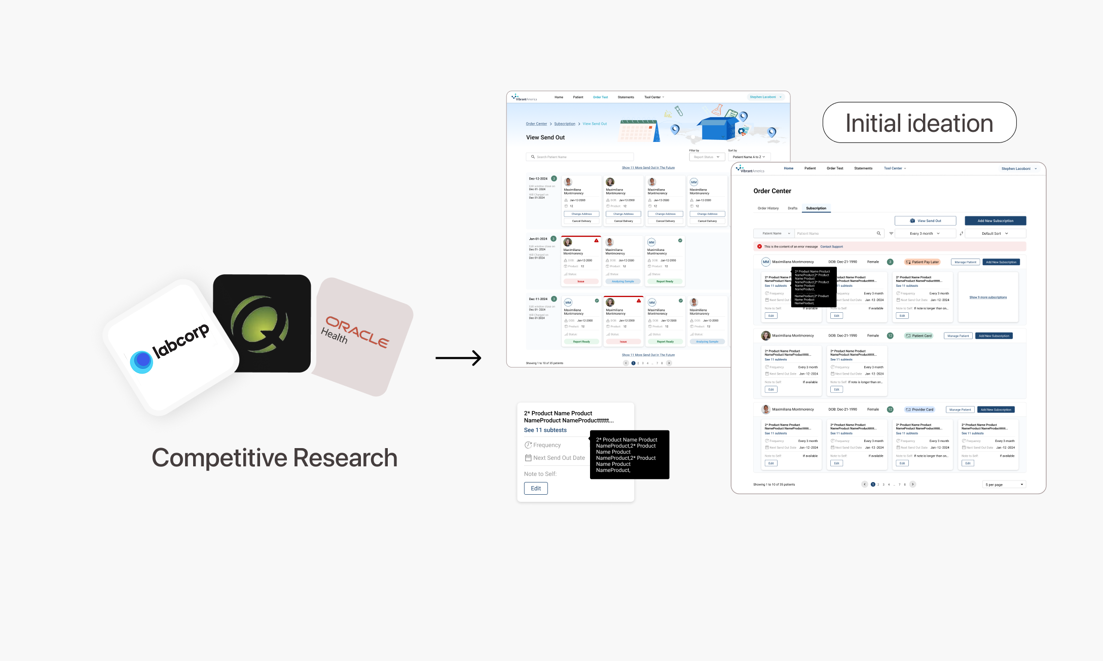
A few of the versions along the way
Once ideation settled, I built everything into one testable prototype and put it in front of providers and the team.
Early testable prototype
Testing with providers and engineers surfaced something the original design hadn’t accounted for: providers weren’t used to seeing Select All at two levels, and sometimes selected more than they meant to.
Feedback we received
We realized providers didn’t need to understand every layer of the hierarchy — just a clearly labeled batch and a Select All that stayed put was enough. So we pulled the two levels apart visually, and kept the batch header front and center.
What we assumed needed full flexibility, it turned out, just needed clear layering.
The final solution, and comments
As the sole designer, I led the workflow while providers and engineers shaped the evidence and constraints.
A clearer experience that scales with daily operations.
Patient details appear once, so providers can scan subscriptions as one organized workflow.
Providers can update 3–12 subscriptions together instead of reopening each card.
Fewer repeated steps reduce the work required to manage recurring orders at scale.
Clear batch context and confirmation make high-volume work easier to review and control.
The portal already holds subscription schedules, order rules, and patient history. This concept uses those signals to prepare routine changes and send only conflicts to providers.
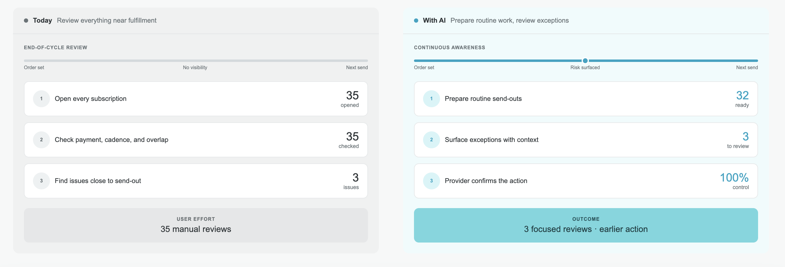
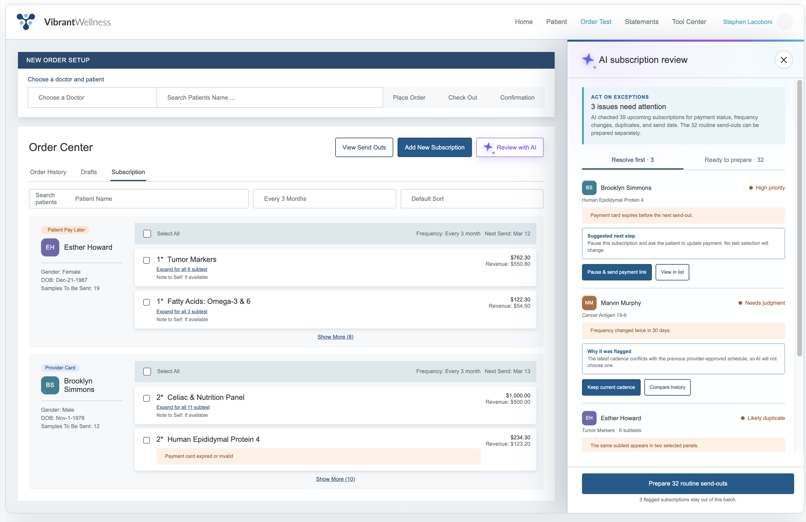
Measure next Review time, override rate, and prevented subscription errors.
These lessons changed how I define work, involve engineering, and balance efficiency with risk.
Providers think in patients and batches—not database objects. Mirroring that operating model made clarity structural instead of cosmetic.
Batch actions increased speed and risk together. Selection feedback, confirmation, and recovery had to scale with their power.
Early engineering input separated visually simple ideas from solutions that would stay simple in production.
A workflow scales when growing volume does not require more training, support, or vigilance.
This is just a snapshot of the entire design process.
Reach out for the full story.


Simplifying DeFi real-estate investing before the product was acquired by Ark7.
