

VIBRANT CRM · 2026

One number everyone can actually trust.
- Role
- Senior Product Designer
- Timeline
- 4 months
2026 - Team
- 1 Product Designer
2 Engineers
1 RevOps Partner
3 Client Success Team Members - Skills
- Product Design
Data Visualization
UX Research
Overview
How do you turn fragmented revenue, risk, and account data into one trusted view?
Vibrant CRM is the internal tool client success and revenue teams use to manage Vibrant's provider accounts.
Before this redesign, “which accounts need attention” had a different answer depending on which spreadsheet or person you asked. I designed the Dashboard and Client Profile that made revenue, risk, and account health readable from one screen instead of pieced together by hand.





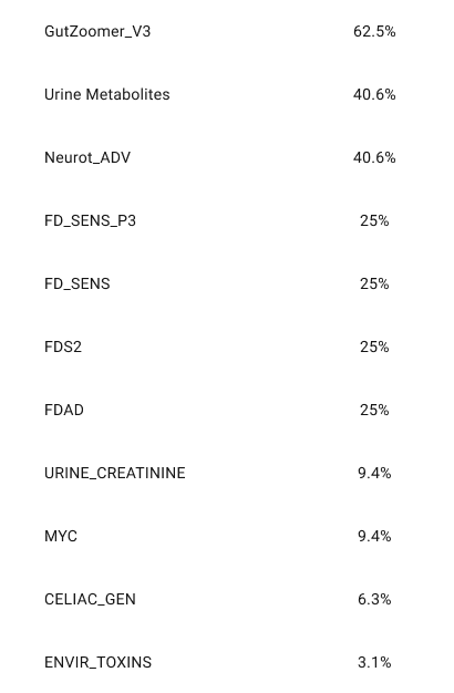
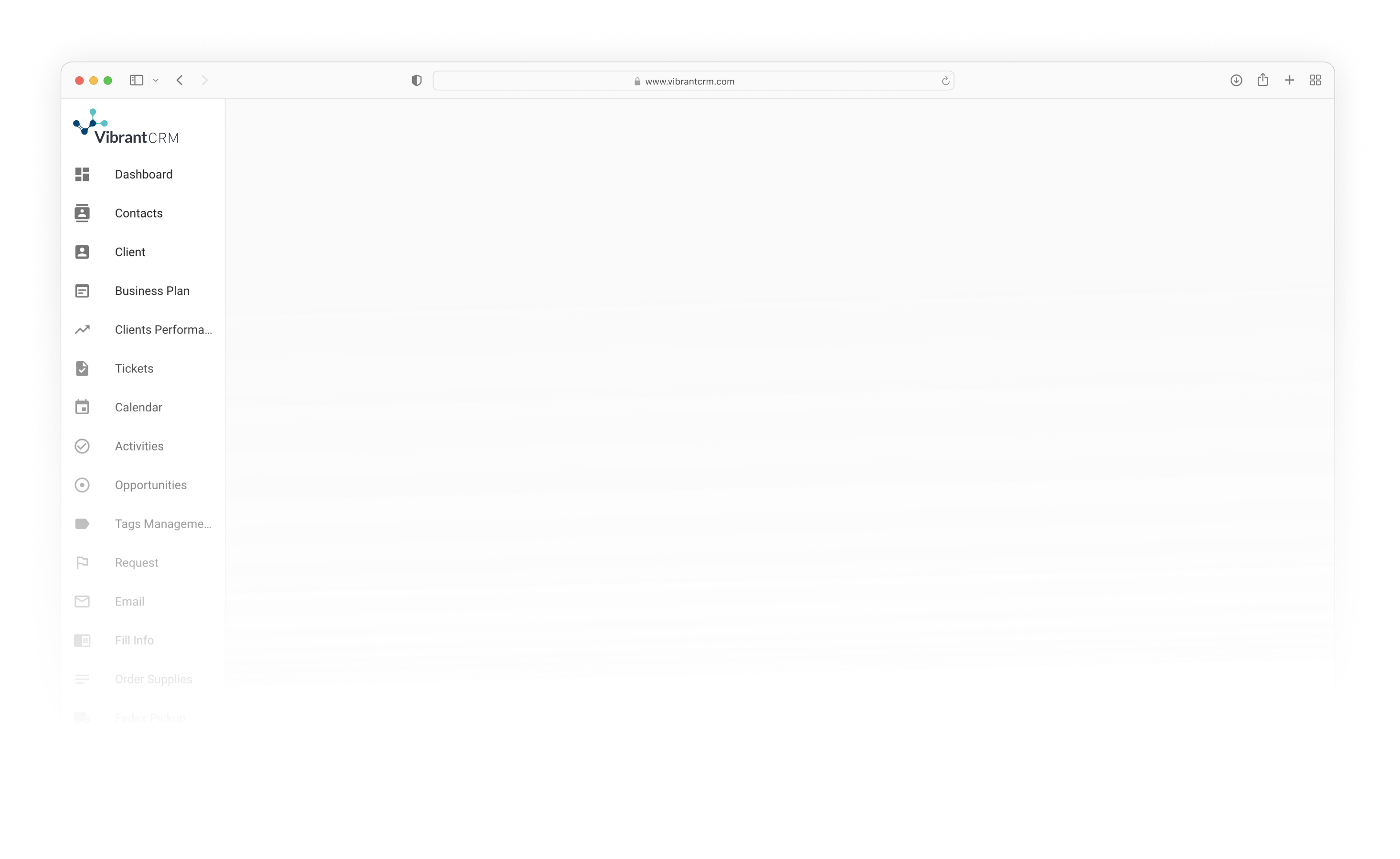
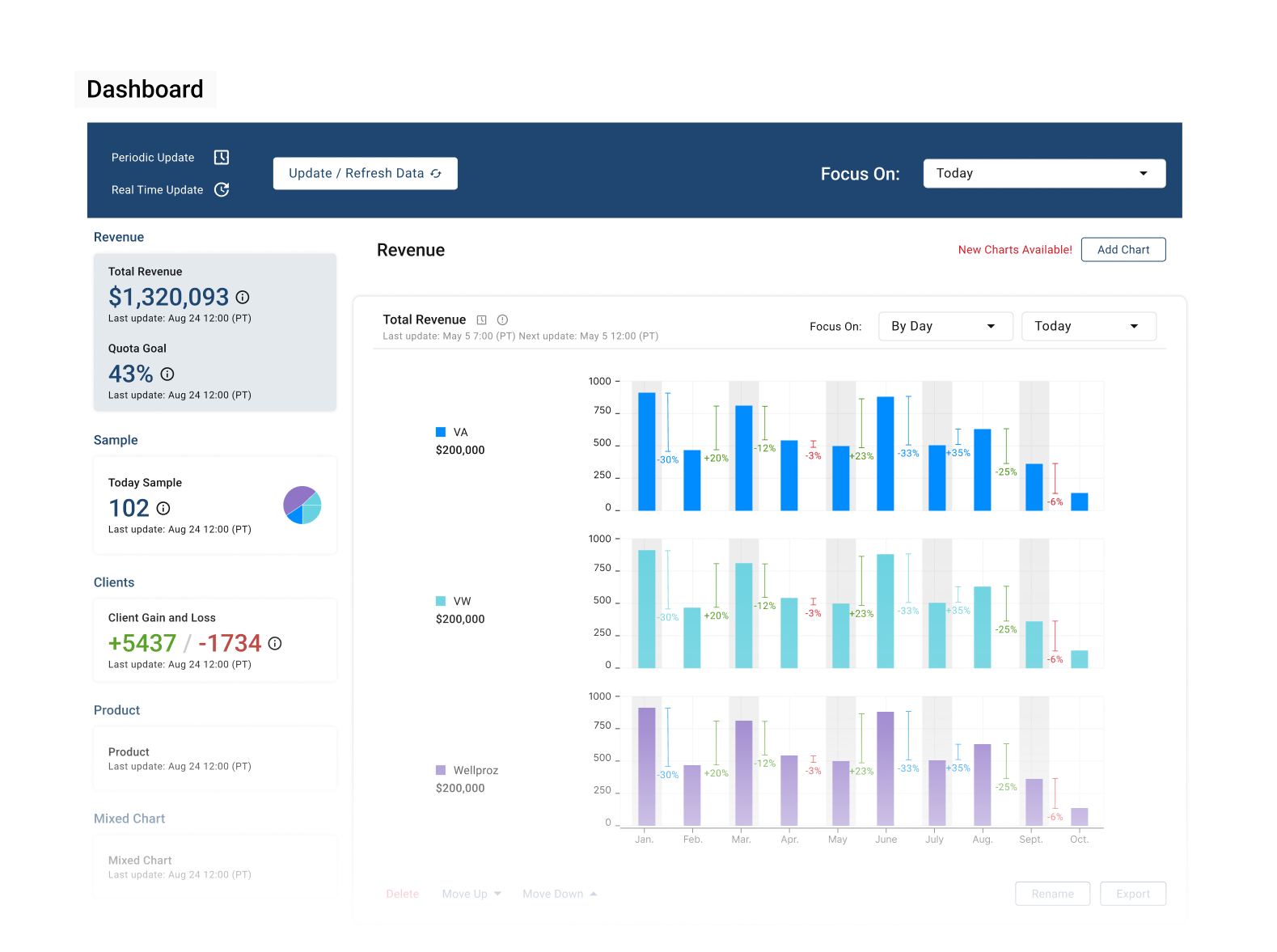
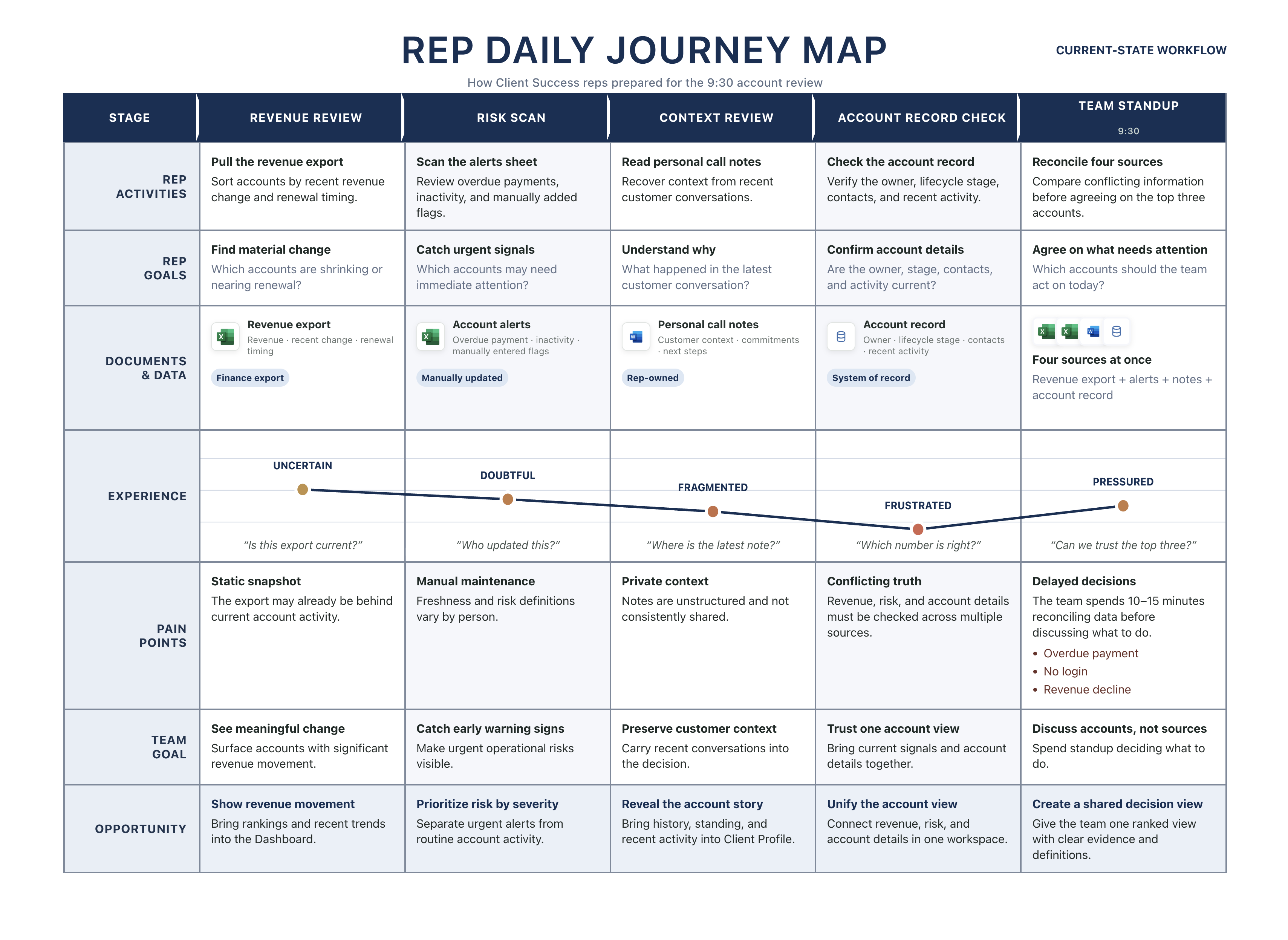
The client success team opened three tabs before checking the account record.
Every morning, the client success team pulled a revenue export, a manually updated alerts sheet, and personal call notes before checking the system of record. By the 9:30 standup, everyone named their top 3 accounts at risk, but risk meant something different to each team member: overdue payment, no login, declining revenue.
Reconciling whose numbers were current burned 10 to 15 minutes before the team could even talk about what to do.
The data existed. It just wasn't built to be looked at together.
A five second overview that still leads to the full account story.
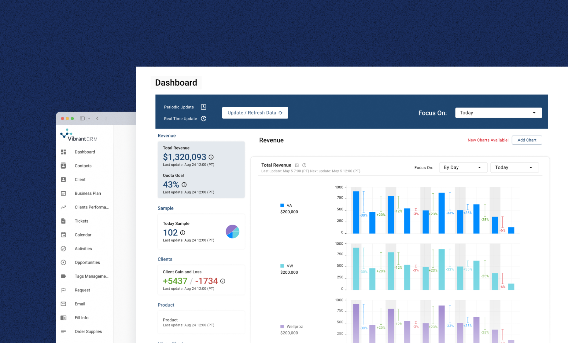
The Dashboard gives executives a concise view of revenue movement, risk, and growth. The client success team can scan the same signals, then open Client Profile when they need history, activity, and account detail. One dataset supports two depths of use.

Revenue ranking, alerts, and trends in one view
Every account tells its own story once you click in.
Dashboard answers “who needs attention.” Client Profile answers “why.” Overview and Summary bring an account's history, standing, and recent activity onto one page, so a client success team member walks into a call already knowing the story instead of piecing it together live.
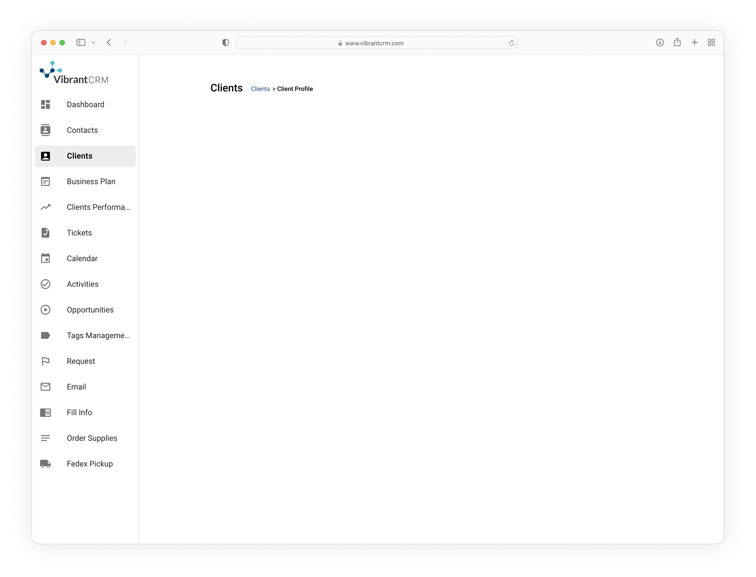
From “who needs attention” to “why”
Finding one account shouldn't feel like a filter puzzle.
Client names in the data were inconsistent: abbreviations, legal names vs. practice names, renamed accounts. Search for Revenue doesn't require an exact match, so typing what a team member remembers still finds the account.

Fuzzy matching across remembered and legal names
Executives and the client success team needed to see the same data in completely different ways.
The first version tried to answer both audiences on one screen. In a standup meeting, I watched a VP of Sales scroll past the alert list and go straight to a single revenue number. They didn't want the workspace, they wanted the answer. Ten minutes later, a client success team member opened the same screen and started scrolling for the account they'd flagged the day before. Same page, two completely different jobs.
I split it into a summary layer, the Dashboard, and a detail layer, Client Profile. Same data, two levels of detail, on purpose.
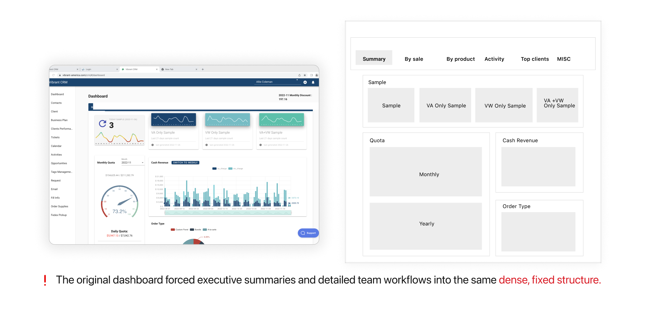
Executive
Summary
Team Member
Detail Workspace
The alert list started as “flag everything.” The client success team stopped reading it within a week.
The first version gave every change equal weight. A missed payment and a routine login got flagged the same way, same color, same size, sorted only by time. In week one, a senior CS rep told me she'd started ignoring the list entirely and going back to her own notes, because she couldn't tell what actually needed her attention that day.
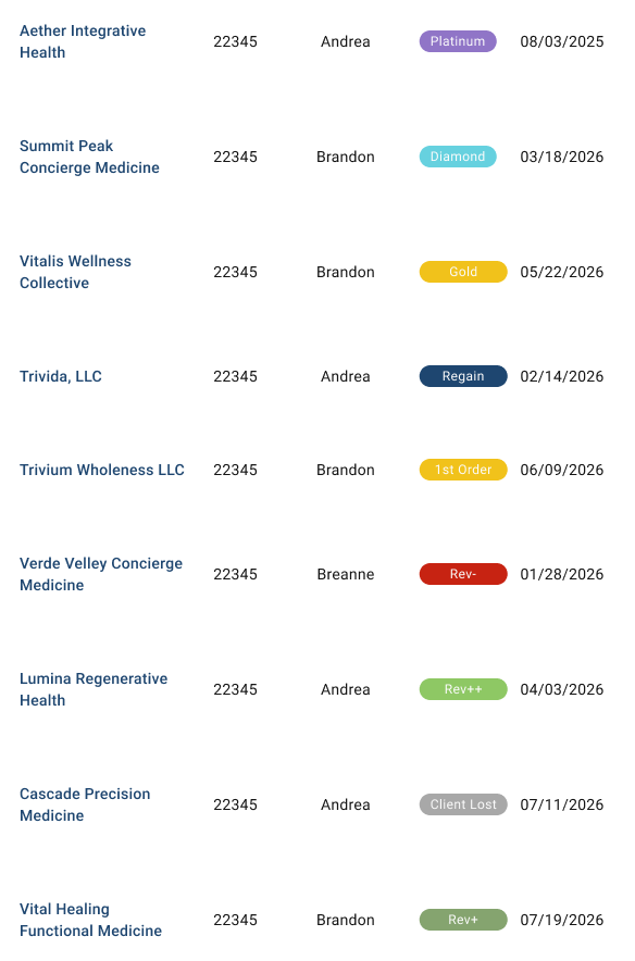
I gave every event type its own color and label, and added a filter so the team could isolate what mattered that day instead of scrolling through everything. A Client Lost and a first order are now visually distinct before you even read the row.
From one undifferentiated feed to a color-coded, filterable alert list
The revenue ranking answered a question nobody had actually agreed on.
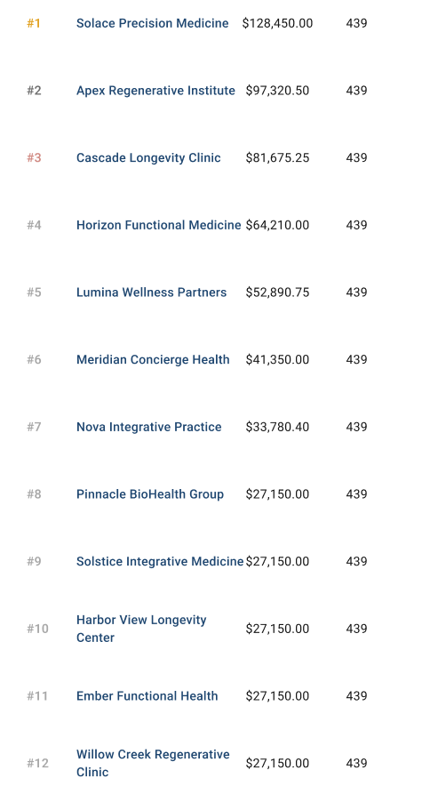
'Rank clients by revenue' sounds simple until you ask: this month, this quarter, or growth rate? I first heard it collide in a standup. Two team members named different accounts as 'our top client' in the same breath, each looking at a different number. Sales and Revenue Ops had been running on separate definitions without anyone flagging it.
I gave the ranking a visible time range toggle instead of a silent default, so it was always clear which number people were looking at.
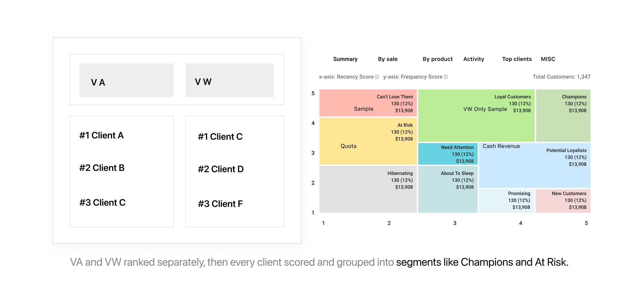
A visible time window makes the ranking unambiguous
Research
Watching the client success team build its own workarounds instead of asking members to describe them.
Instead of asking team members to explain their process, I watched them do it: which spreadsheet they opened first, what they copied into a second tab, and what they trusted more than the export.
I also sat in on two weeks of standups, timing how much of that fifteen minutes went to arguing about numbers instead of talking about accounts. The workaround was the real spec.
Goals
- Find out which numbers client success team members actually acted on, and which they ignored.
- Understand what “an account needs attention” meant day to day, not just in theory.
- Measure how much standup time was lost to reconciling data versus real discussion.

Explore the chaos behind the client success team's daily workflow
What changed once it shipped.
Standup's data reconciliation time dropped from 10 to 15 minutes to under 3. The client success team opened the Dashboard together instead of comparing spreadsheets out loud.
What changed beyond the screen
One place, one definition.
I brought revenue, risk, and account health into one structure, made time ranges visible, and reused the same patterns across the CRM.
Watch the meeting, not just ask about it.
I joined Client Success standups, then carried what I observed into critique, handoff, QA, release, and documentation.
Get everyone to make the call together.
Sales wanted growth, RevOps wanted accurate numbers, and Client Success needed the next action. I helped the group agree on what the product should show, investigate, and leave out.
I turned a faster personal workflow into a team capability.
After proving the workflow in my own projects, I built and led a hands-on workshop on automation, MCP, and real-world tools. It gave designers a repeatable way to prototype with AI, bring engineers in earlier, and test ideas before committing to a build.
The workflow reached 10 designers across two teams and made high-fidelity prototyping meaningfully faster. My role grew from using the tools myself to helping the wider design team change how we worked.
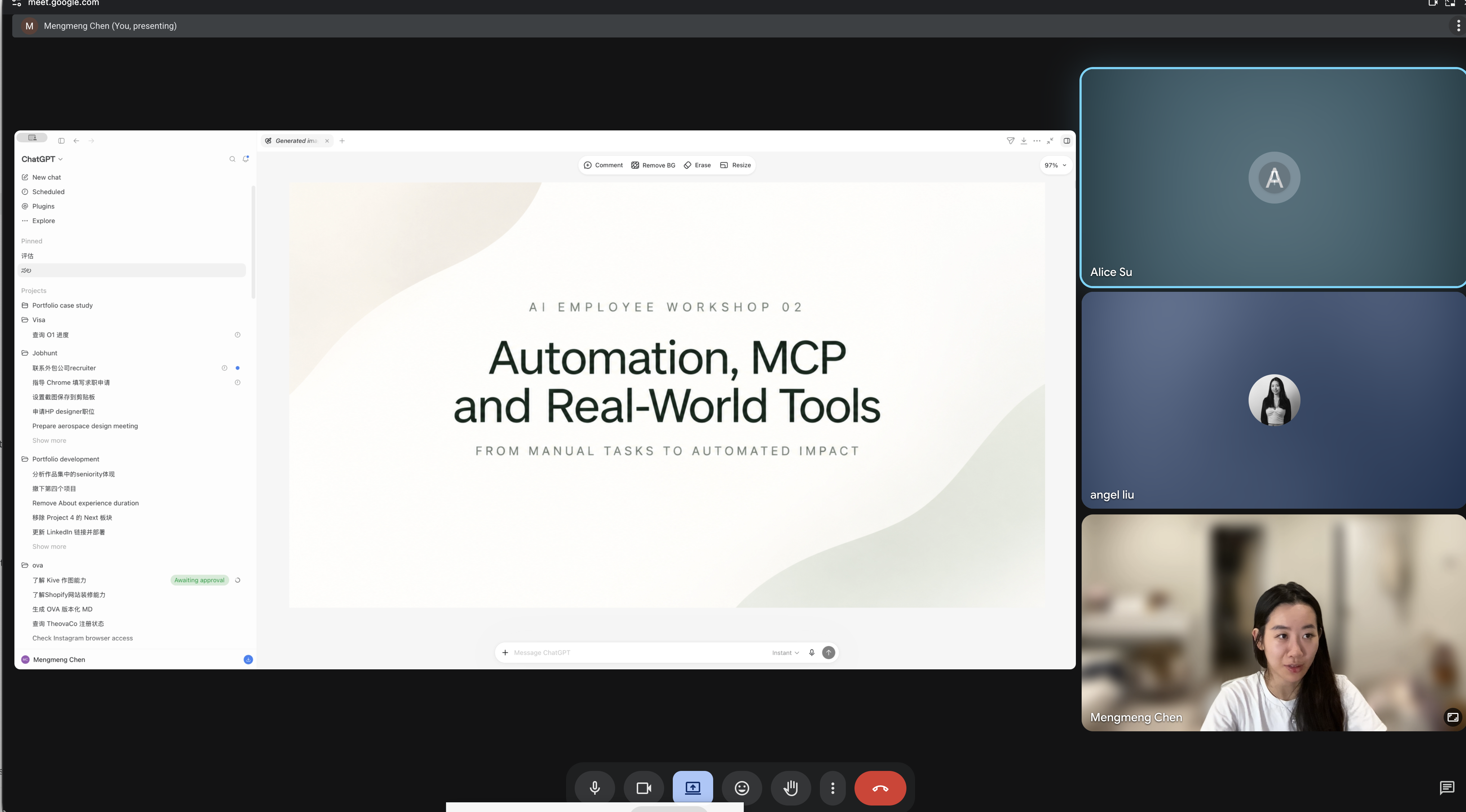
The dashboard solved where to look. The next opportunity was reducing the work it took to decide.
Even with one shared view, Sales and Client Success still spent standup reading charts, comparing history, and turning signals into follow-up actions. AI could prepare that analysis before the meeting—without taking the final decision away from the team.
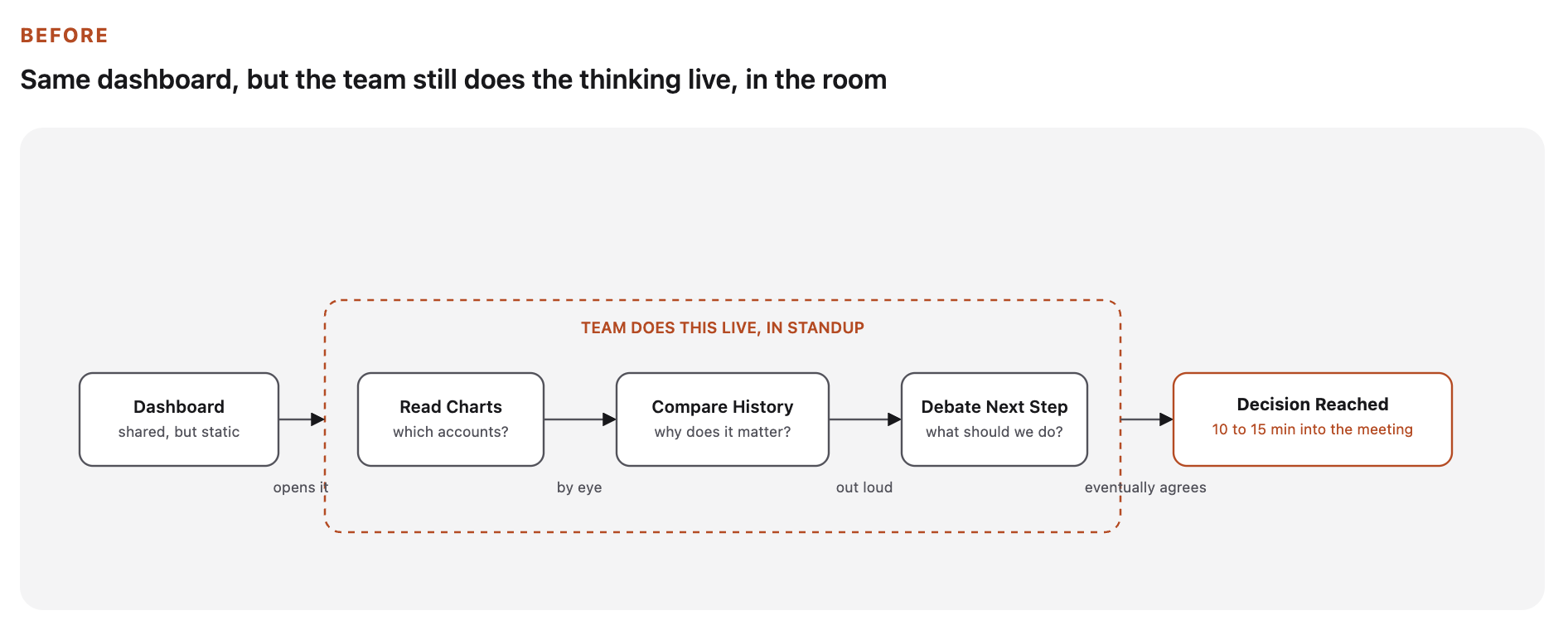
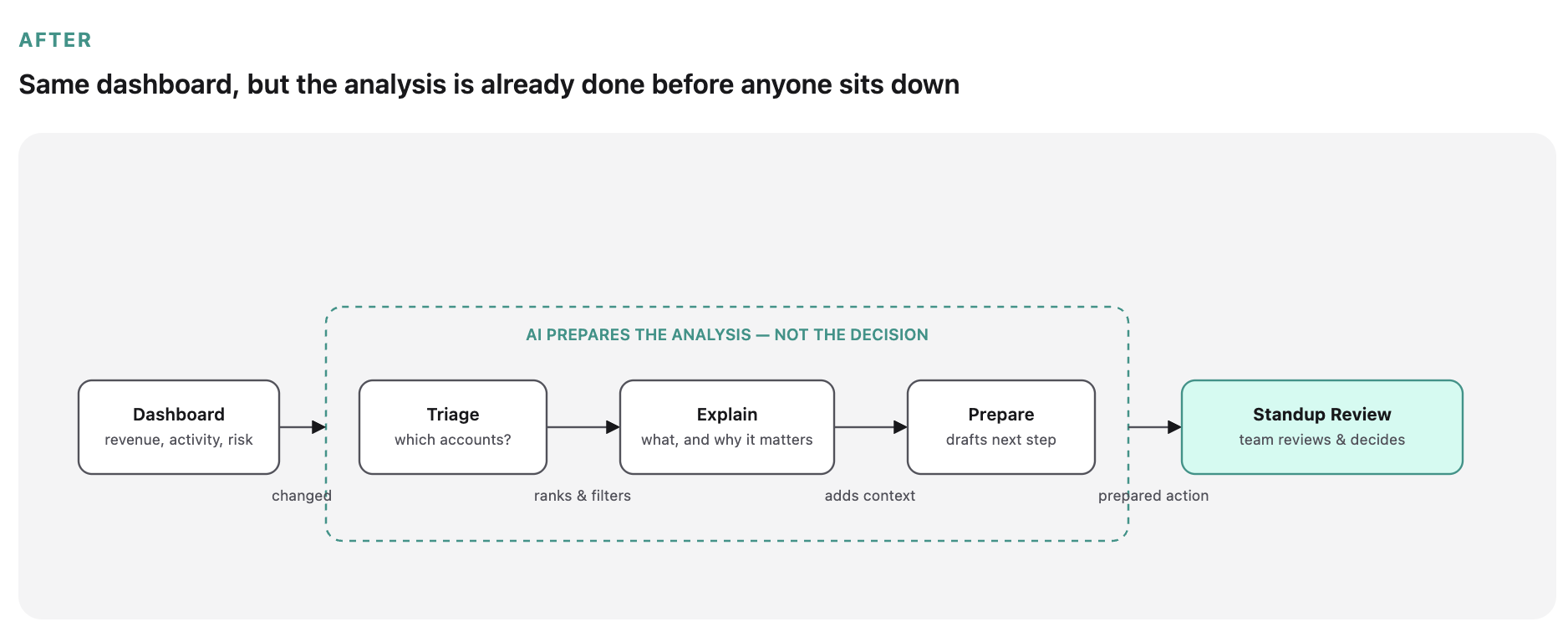
The shift: from spending the meeting analyzing accounts to reviewing prepared, explainable actions
EXISTING CLIENT PROFILE
The data was there; the team still had to make sense of it
The profile brought activity and revenue into one place. But users still had to compare six months of charts, spot unusual changes, and decide the follow-up themselves.

V1 — One place for the data, but the analysis and next action were still manual
AI-ASSISTED CLIENT PROFILE
Bring the analysis to the team before standup
AI compares each account against its own baseline, highlights the strongest signal, explains its confidence, and drafts a next step. Sales and Client Success review the recommendation instead of building it from scratch.

V2 — The team arrives at standup with the account story and a reviewable next step already prepared
Measure nextTime from signal to action, accepted recommendations, and follow-up completion.
What I learned
One screen can't serve two audiences well.
Executives needed a summary; Client Success needed a workspace. The same data worked better at two levels of detail.
Watch the work, not just the interview.
Two weeks of standups exposed the real time sink: spreadsheet reconciliation. No interview had named it.
A source of truth needs visible rules.
Severity and time-window rules had to be explainable before the team would stop checking its own spreadsheets.
Shared definitions are a design outcome.
The hardest part wasn't the UI. It was helping Sales, RevOps, and Client Success agree on what risk and revenue meant.

This is just a snapshot of the entire design process.
Reach out for the full story.

GridPilot AI
Designing a clear, intuitive product experience for complex grid interconnection workflows.